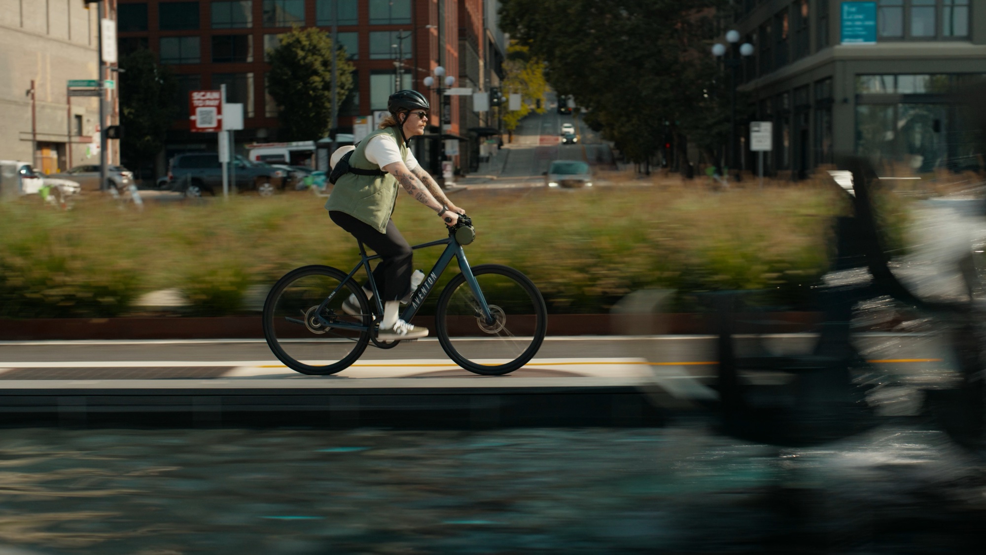
Product features sit inside real riding situations, carried by a relaxed funk rhythm.
Paid film / 01
Campaign film / Selected work
Featured / 9 films
Nine films built from the same city ride. I led the launch film’s color grade, fine cut and type animation, then carried its visual language into paid, social and web edits.
↓Launch film contribution
Color grading / Fine cut / Type animation
01—04
Four cuts, each built around a specific product idea.
Scroll horizontally, swipe sideways, or use the arrow keys to browse the films. Vertical scrolling moves the page.
Product features sit inside real riding situations, carried by a relaxed funk rhythm.
Lens-lock effects hold attention on the bike while custom transitions connect each beat.
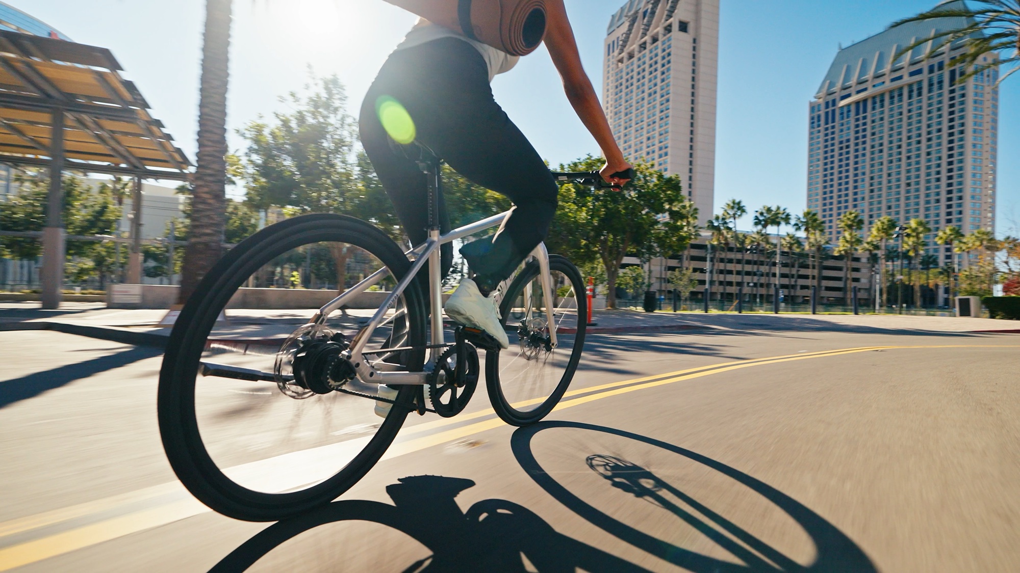
Repeated actions across riders and locations make weight and range visible without extra copy.
Quick cuts raise the pace; matching angles keep the sequence clean.
01
The campaign reduced to a clean opening loop.
Review
The grade, pacing and match-cut decisions that shaped the finished films.
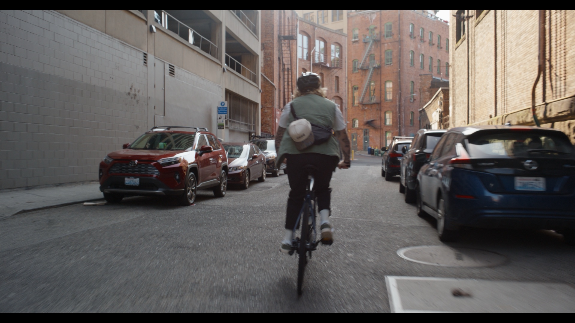
Color progression
01—04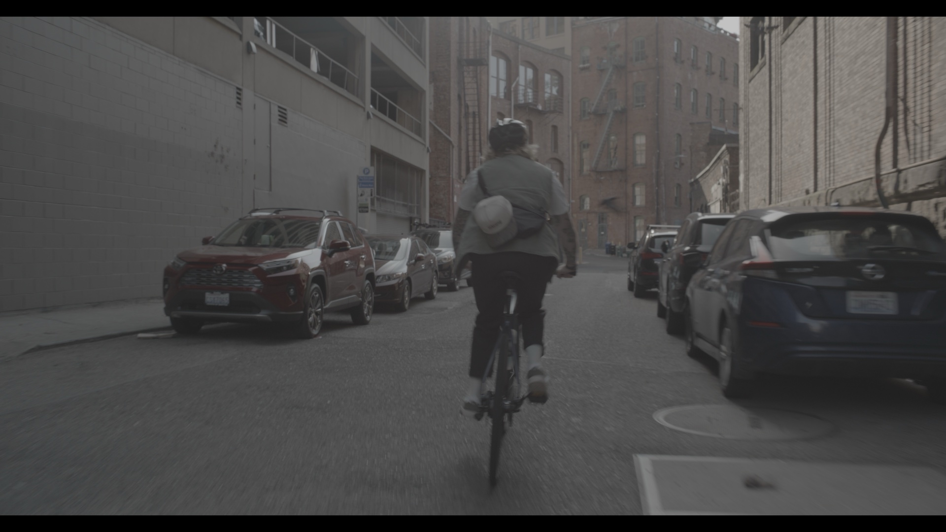
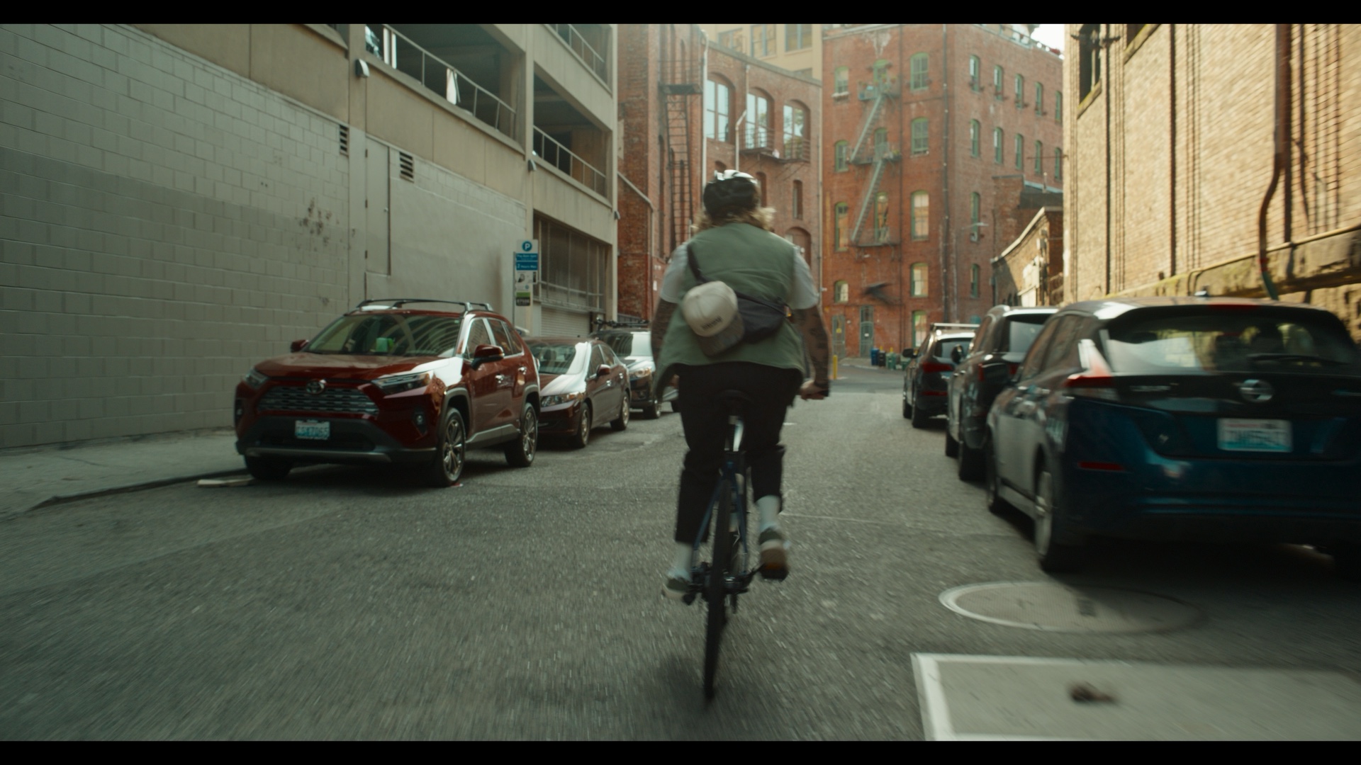
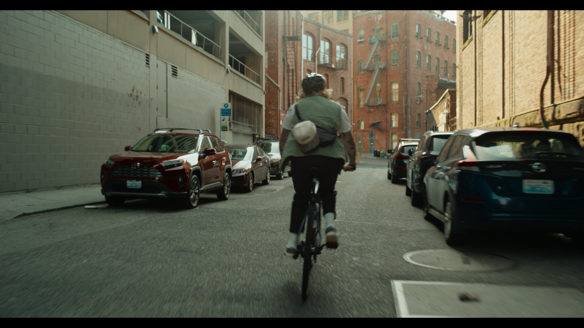
01The Premiere sequence made a round trip through DaVinci, keeping the edit intact while opening the footage up for a full grade.
02A light cyan bias keeps the city feeling clean and easy. Midtones stay neutral so skin and product color do not drift.
03Keyframed reframing corrected beats that landed late in the rough cut. The type animation follows the same fast-in, slow-out curve.
04Shots with similar framing and camera direction sit together, so the cut can move quickly without feeling scattered.
05Different riders carry the bike through the frame. The action explains its weight faster than a line of copy could.
 浙公网安备33010802014660号